Well, someone (I wonder who) made a Paladin Starter picture, as crappy as it was back then, when the Paladin Starter was made.Clonkinator wrote:Because it's faster and easier that way. Seriously, instead of complaining about it, why don't you go ahead and make some nice title icons for the modules yourself if you think it's that easy?Maxaxle wrote:"appropriated"!? Seriously, why couldn't we just have made our own?
Title Art?
Moderator: Developers
-
Maxaxle

- Darkshine Knight (Extremist fanatic)
")
- Posts: 4035
- Joined: Fri Jul 25, 2008 8:16 pm
- Location: San Diego, CA
- Contact:
"Failing to plan is planning to fail."
Bug me if you want to play a game.
Bug me if you want to play a game.
-
Agent of Dread

- Protector (Senior Member)
")
- Posts: 8991
- Joined: Wed Jul 23, 2008 8:46 pm
- Location: Australia
- Contact:
 ---vs---
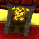
 ---vs---
 ---vs---
 ---vs---
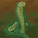
 ---vs---
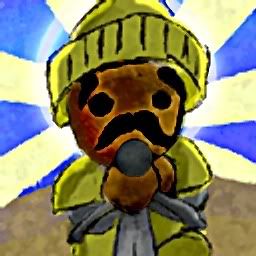
 ---vs--- something random
-
Zefz

- Squirrel Knight (Administrator)
")
- Posts: 3820
- Joined: Wed Jul 23, 2008 1:27 am
- Location: Norway
- Contact:
Interesting.
The Cobol Palace image looks really menacing. The Emperor looks much more... 3D than before. I think it looks a lot better I'm not just yet used to the style.
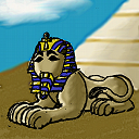
Looking at the others I must agree that they look much better than the old ones, especially the Griffin Tower! I needed to look a few times at them because as I mentioned before, the style was drastically different than what we've used before. The last one with the Sphinx is for Sandweg I assume?
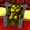
The only complaint I have is the Paladin. His eyes look very funny It doesn't look right.
The Cobol Palace image looks really menacing. The Emperor looks much more... 3D than before. I think it looks a lot better
Looking at the others I must agree that they look much better than the old ones, especially the Griffin Tower! I needed to look a few times at them because as I mentioned before, the style was drastically different than what we've used before. The last one with the Sphinx is for Sandweg I assume?
The only complaint I have is the Paladin. His eyes look very funny

-
bgbirdsey
- {]-[0{0|307 (Developer)
![{]-[0{0|307 (Developer)](./images/ranks/rank_chocobot.png "{]-[0{0|307 (Developer)")
- Posts: 1864
- Joined: Wed Jul 23, 2008 4:22 am
- Location: Minnesota, USA
If you look closely a the adventurers eyes you will see similar detail, actually. The reason it is more prominent here is that I over adjusted the gamma to make everything brighter.
I think that the 3d-ness of the cobol emperor can be turned down a bit. I added quite a bit of post processing to the image that added more and more of that effect... the background still needs to be shaded and maybe made less prominent.
The sphinx for sandweg was as egoboo as I could make it. I'm not really sure that it is really appropriate, since there is no sphynx there! LOL
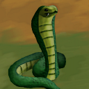
Also, the general design of the snake could be made more egoboo if we over-emphasized the size of the head or something. On the other hand, many of the monsters are very skinny (like the ghoul)
I think that the 3d-ness of the cobol emperor can be turned down a bit. I added quite a bit of post processing to the image that added more and more of that effect... the background still needs to be shaded and maybe made less prominent.
The sphinx for sandweg was as egoboo as I could make it. I'm not really sure that it is really appropriate, since there is no sphynx there! LOL
Also, the general design of the snake could be made more egoboo if we over-emphasized the size of the head or something. On the other hand, many of the monsters are very skinny (like the ghoul)
-
penguinflyer2222

- Queen Penguin (Senior Member)
")
- Posts: 6614
- Joined: Wed Jul 23, 2008 1:51 am
-
PurpleSquerkle

- Massive Gelfeet (Developer)
")
- Posts: 3176
- Joined: Wed Jul 23, 2008 4:54 am
- Location: Oakland, CA
- Contact:
-
Agent of Dread
- Protector (Senior Member)
- Posts: 8991
- Joined: Wed Jul 23, 2008 8:46 pm
- Location: Australia
- Contact:
Tbh, I don't really like the new Cobol Palace one.
Granted the old one needed work, but this one looks a bit ungood. Bad proportions, if you don't mind me saying.
Granted the old one needed work, but this one looks a bit ungood. Bad proportions, if you don't mind me saying.
- Linktree: linktr.ee/trilbs -
-
woodmouse

- Monolich (Senior Member)
")
- Posts: 4586
- Joined: Wed Jul 23, 2008 3:53 pm
- Location: Finland
- Contact:
Hey, I just finished this some sort of title image. It's Lord Bishop... with flashy background. 
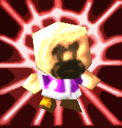
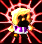
Two versions, one more saturated, one less.
Which is better? Can this be used somewhere? xD
EDIT:
Here's a pathetic try at making an Arch Mage trials title.
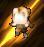
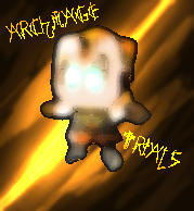
One with text and one without. C&C? xD
Two versions, one more saturated, one less.
Which is better? Can this be used somewhere? xD
EDIT:
Here's a pathetic try at making an Arch Mage trials title.
One with text and one without. C&C? xD
Once upon a time, when unicorns roamed the earth...


