Page 12 of 22
Posted: Mon Jun 15, 2009 2:13 am
by PurpleSquerkle
bgbirdsey wrote:all of the "grain or texture" of the original is just a 256-color quantization problem. I can easily induce that in any image by choosing to reduce the image to 8-bit with error diffusion.
I'm well aware of that, but it is not at all what I'm talking about.
Your despeckled images are fine and they still preserve the texture I'm talking about.
Aaron's pictures just have a lot more complexity, and they look like they were painted on a canvas. The fabric looks like fabric.
Yours and Woodmouse's both look very... plastic?
Posted: Mon Jun 15, 2009 2:51 am
by bgbirdsey
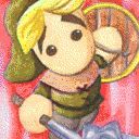
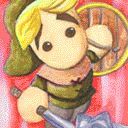
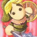
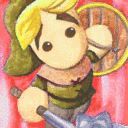
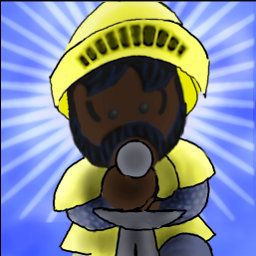
One of these images is the original Adventurer image. The others were generated by reducing the so-called "plastic" image to a 161 color palette, as in the original image.
1) Pick an amount of time and tell me (within the time limit) which one is the original without looking at the filenames and how you made your decision.
2) Tell me why the completely randomly generated texture in the other images are
not
- more complex
painted on a canvas
fabric-like
Posted: Mon Jun 15, 2009 3:16 pm
by PurpleSquerkle
I don't understand what you're trying to say/prove.
All I'm saying is that your Paladin drawing looks significantly different than the Adventurer icon -- even when the Adventurer is despeckled.
Every rendition of the Adventurer you've done looks fine to me. But the Paladin is missing something; it's hard to explain, but the best I can do is just say it looks way too smooth. More like plastic than fabric. Also, the lines aren't the same, either...
However, I should point out that I'm picking nits, because I myself could probably never do anything like Aaron's original images, and I'm unsure if anyone can. Everything I've seen so far just looks seriously different from the original icons...
It may be impossible to make the pictures uniform, but it's really a shame that we haven't been able to so far.
Posted: Mon Jun 15, 2009 4:27 pm
by bgbirdsey
I don't understand what you're trying to say/prove
The above example was to illustrate that the features that you have commented on as being so important are, indeed just accidental/random noise.
As I showed earlier, such texture can be added to other images, as well.
From
to
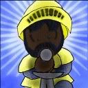
.
Highlighting this effect above all other does not seem to help people make more acceptable art.
All I'm saying is that your Paladin drawing looks significantly different than the Adventurer icon
In this, we agree. Booger's original drawing did not look too much like Aaron's drawings, either and I inherited that difference when I adapted the drawing.
The only addition to the drawing was to take the face from the exact in-game face of the paladin. As I have said, it is likely that the eye style should be altered from the in-game style to the title-drawing style.
Also, the lines aren't the same, either
This critique is SO much more more useful than the 8-bit dithering comments. In fact, this is the central issue of what constitutes Egoboo art.
I think you would agree that Booger's art, including zefz old avatar and the banner at the top of this page this page are definitely
official egoboo art even though they do not have that 8-bit chunkiness at all.
Posted: Mon Jun 15, 2009 9:20 pm
by Maxaxle
Looking closely (after trying, giving up, and cheating), the smoothing fools with the color. Do not want, to put it simply.
Posted: Mon Jun 15, 2009 11:34 pm
by Killer Frog
Maybe re-doing the original icons would be a good idea. You're never going to exactly re-create his style, so why not try and re-do it in your style. I know this might sound liek herecy, but it might be the best idea, instead of creating lackluster icons.
Posted: Tue Jun 16, 2009 11:02 am
by Agent of Dread
Yeah, I never really liked the new ones at all.
Furthest I was going was the new Pally one (before the one showcased here, na klar.)
Posted: Tue Jun 16, 2009 12:25 pm
by woodmouse
I like the new title pics, especially the Catacomb ones...
@Cimeries: Chat?
Posted: Tue Jun 16, 2009 8:15 pm
by Agent of Dread
I mean, they are all good, except I don't like them standing alongside the originals.
Posted: Tue Jun 16, 2009 8:38 pm
by bgbirdsey
The title pics that were.... ahem... "appropriated" from other games should probably be replaced.
Posted: Tue Jun 16, 2009 8:59 pm
by Cimeries
bgbirdsey wrote:The title pics that were.... ahem... "appropriated" from other games should probably be replaced.
Yep. Griffin Tower and the Crypt are modified images from Majesty.
Posted: Wed Jun 17, 2009 12:05 am
by Maxaxle
"appropriated"!? Seriously, why couldn't we just have made our own?
Posted: Wed Jun 17, 2009 12:05 am
by Killer Frog
Cimeries wrote:bgbirdsey wrote:The title pics that were.... ahem... "appropriated" from other games should probably be replaced.
Yep. Griffin Tower and the Crypt are modified images from Majesty.
Heh, didn't notice that... Maybe it's time to dig out my old copy...
But still, a total re-doing of the tiles is the best idea in my useless newbie opinion. Maybe add the old icons to the concept art section of the website or some unlockable menu thing.
Posted: Wed Jun 17, 2009 8:15 am
by Shade
Maxaxle wrote:"appropriated"!? Seriously, why couldn't we just have made our own?
Because it's faster and easier that way. Seriously, instead of complaining about it, why don't you go ahead and make some nice title icons for the modules
yourself if you think it's that easy?
Posted: Thu Jun 18, 2009 3:08 am
by PurpleSquerkle
@Bgbirdsey: I was never talking about dithering.
There's definitely a different texture/lighting quality to Aaron's drawings that is totally independent from the dithering imposed by the low color limit.
I'd like to think I've done enough work with 2D graphics to recognize what's going on; I was always totally aware of the dithering, and in my mind I isolated it as something entirely different that has nothing to do with the style.
As I've said at least twice already, even your smoothed Adventurer titles have something that your Paladin -- even the dithered one there. It still doesn't have the texture I'm talking about.
To make sure I'm being entirely clear: I'm not talking about the "texture" generated by the color limit. I'm talking about the way the other images handle lighting and color variation. If you look at the Adventurer's hat or shield... or anything else on him, really... you can see that it has a mottled/dappled look that clearly has nothing to do with the color restrictions. You can smooth out the picture and even blur it beyond all recognition, and the texture I'm talking about is still there. Every version of the Adventurer I've seen so far (even the ones you did in the thread about vector graphics) has preserved this texture (though some have done it better than others), as far as I can remember.
I realize that the Paladin is wearing metal armor and not fabric, and it should look shinier and smoother, but it just looks... Like I said already, a little too much like plastic. Even his skin has that some measure of slightly unnatural smoothness.
To summarize what I'm saying, here's a picture expressing what I mean (although it's probably so exaggerated that it doesn't really show what I'm talking about very well):
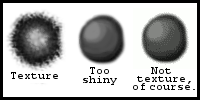
As you can see, I understand that color limits create what some people might call a texture... but I am not one of those people. (Of course, dithering can also intentionally be used to create textures, as is seen fairly regularly in pixel art on a smaller scale).
The texture I'm talking about is something pretty different... You might not be able to see it, but to me it's very real, even if it only exists in my imagination (which I doubt).

However:
As I was saying already, I'm probably being too nitpicky; you've really done a commendable job. It's just a shame nobody has been able to reproduce something that looks like the original images yet (I doubt very much that I could do any better). However, like I said, this might be impossible, so your picture is good.

...Although I do have to admit that I would like to see it with better lines and maybe with a face that's a little different stylistically (more in line with the other characters' starter images, like you were saying)...