Page 11 of 22
Posted: Sat Jun 13, 2009 1:19 am
by Poop Loops
I agree that the "grainy" looking images look very cool. The cartoonish style works well to keep Egoboo a "fun" kind of game and not really serious.
Posted: Sat Jun 13, 2009 1:47 am
by Hiroy
While the grainy thing is cool, could that really stop anyone from producing something smooth as long as it has that cartoony look?
Posted: Sat Jun 13, 2009 2:11 am
by Poop Loops
No, of course not. But this way it also looks like it's been drawn by crayon, as Purple pointed out. I think that's pretty cool.
Posted: Sat Jun 13, 2009 2:41 am
by bgbirdsey
I think the eyes need to match the ones in the paintings, rather than the in-game style that I used.
Personally I don't like the graininess. I would remove it from the old images if I could do it without introducing more artifacts that I remove.
Posted: Sat Jun 13, 2009 9:08 am
by woodmouse
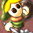
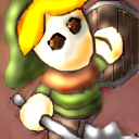
I made this... hmm... "softer" version of the Adventurer starter's title image. If people like it, I can make the others, too.
Posted: Sat Jun 13, 2009 9:51 am
by Zefz
The eyes are all to dominant.
Posted: Sat Jun 13, 2009 10:52 am
by woodmouse
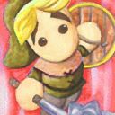
Hmmm...
Is this better?
Posted: Sat Jun 13, 2009 3:03 pm
by Shade
Actually, the eyes don't really look like eyes...
Posted: Sat Jun 13, 2009 3:08 pm
by woodmouse
Clonkinator wrote:Actually, the eyes don't really look like eyes...
Yea, I know.

But it's just so hard to make eyes really look like eyes.
Posted: Sat Jun 13, 2009 4:16 pm
by Poop Loops
That style is pretty cool. It fits the atmosphere of Egoboo well, too. I like the first one better, with the bigger eyes. But the eyes are only slightly too big. The second image has the eyes too small and kind of weirdly irregular, as if the kid had Down Syndrome or something.
They also look like they are slightly at an angle.
Here is my very crude alteration next to your original (yours is the left one):


EDIT: I made another version (the middle one) with less rotated eyes. The one I made first was a bit too much.
Posted: Sat Jun 13, 2009 9:00 pm
by bgbirdsey
This is what I was talking about, but the despeckling process introduces too many artifacts of its own

vs

Posted: Sun Jun 14, 2009 8:22 am
by woodmouse
Hmm, the one Birdsey did looks kinda blurry, I think. I myself like the original one the best, but we can try making smoething. xD
But then, if we change the original title images, Aaron gets mad.
Posted: Sun Jun 14, 2009 8:39 am
by Cimeries
woodmouse wrote:But then, if we change the original title images, Aaron gets mad.
Heh, I doubt he'd like the eyeball one I made off a picture I found in a google search.

Posted: Sun Jun 14, 2009 9:37 am
by bgbirdsey
despeckling process introduces too many artifacts of its own
looks kinda blurry
there is no way to despeckle without making it more blurry.
However, if the blurriness is just in the parts of the image that are not edges, then it is minimized.
original
new despeckled
old despeckled
Posted: Sun Jun 14, 2009 10:21 am
by Agent of Dread
The new one does look pretty good.
It's still a toss-up between that and the original, though.