@Bgbirdsey: I was never talking about dithering.
There's definitely a different texture/lighting quality to Aaron's drawings that is totally independent from the dithering imposed by the low color limit.
I'd like to think I've done enough work with 2D graphics to recognize what's going on; I was always totally aware of the dithering, and in my mind I isolated it as something entirely different that has nothing to do with the style.
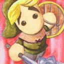
As I've said at least twice already, even your smoothed Adventurer titles have something that your Paladin -- even the dithered one there. It still doesn't have the texture I'm talking about.
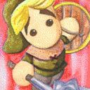
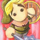
To make sure I'm being entirely clear: I'm not talking about the "texture" generated by the color limit. I'm talking about the way the other images handle lighting and color variation. If you look at the Adventurer's hat or shield... or anything else on him, really... you can see that it has a mottled/dappled look that clearly has nothing to do with the color restrictions. You can smooth out the picture and even blur it beyond all recognition, and the texture I'm talking about is still there. Every version of the Adventurer I've seen so far (even the ones you did in the thread about vector graphics) has preserved this texture (though some have done it better than others), as far as I can remember.
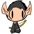
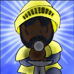
I realize that the Paladin is wearing metal armor and not fabric, and it should look shinier and smoother, but it just looks... Like I said already, a little too much like plastic. Even his skin has that some measure of slightly unnatural smoothness.
To summarize what I'm saying, here's a picture expressing what I mean (although it's probably so exaggerated that it doesn't really show what I'm talking about very well):
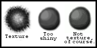
As you can see, I understand that color limits create what some people might call a texture... but I am not one of those people. (Of course, dithering can also intentionally be used to create textures, as is seen fairly regularly in pixel art on a smaller scale).
The texture I'm talking about is something pretty different... You might not be able to see it, but to me it's very real, even if it only exists in my imagination (which I doubt).

However:
As I was saying already, I'm probably being too nitpicky; you've really done a commendable job. It's just a shame nobody has been able to reproduce something that looks like the original images yet (I doubt very much that I could do any better). However, like I said, this might be impossible, so your picture is good.

...Although I do have to admit that I would like to see it with better lines and maybe with a face that's a little different stylistically (more in line with the other characters' starter images, like you were saying)...


 to
to  .
.